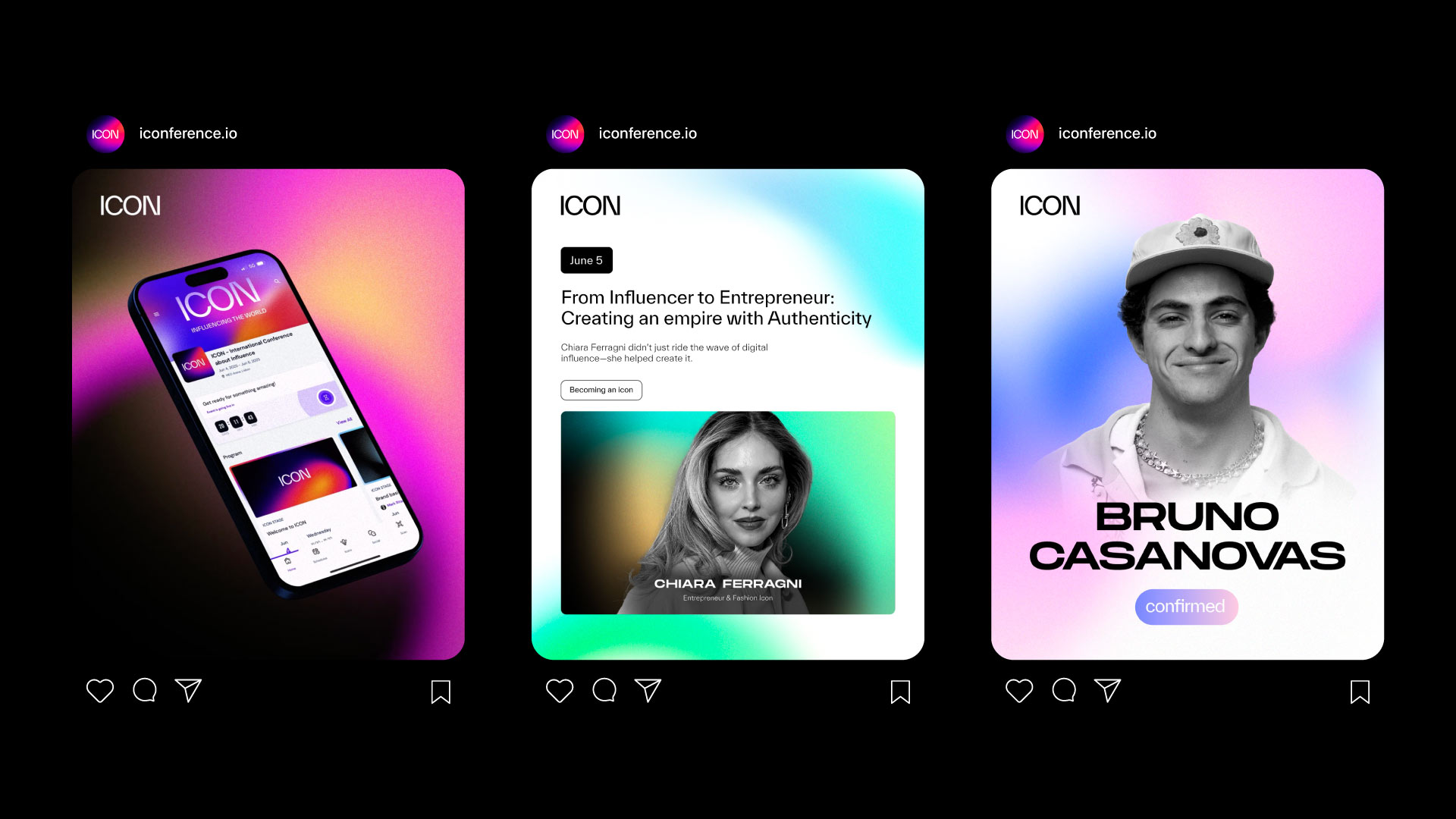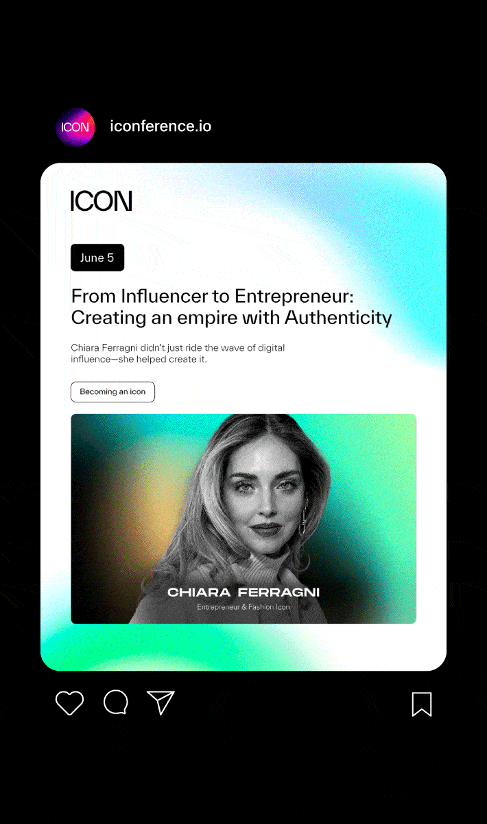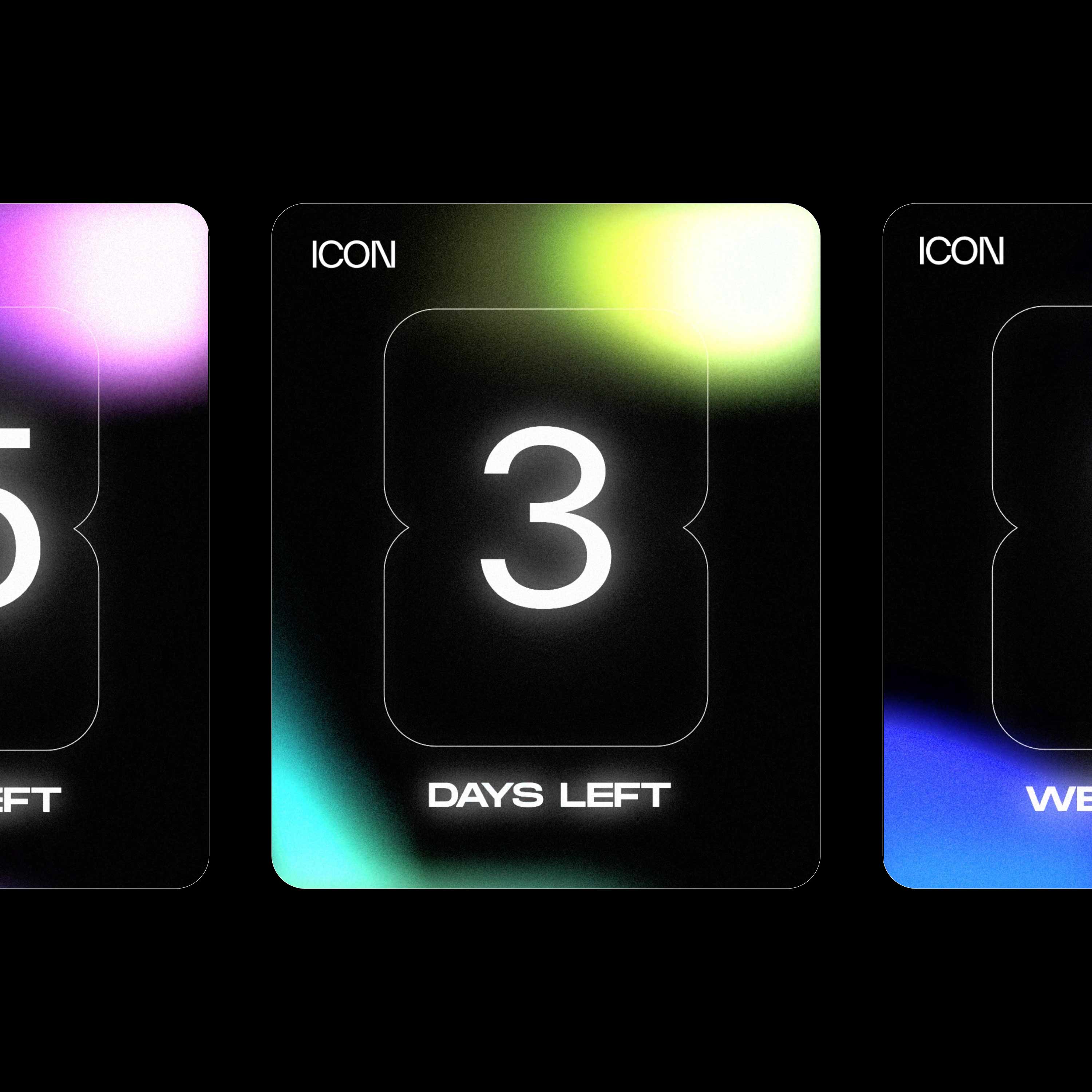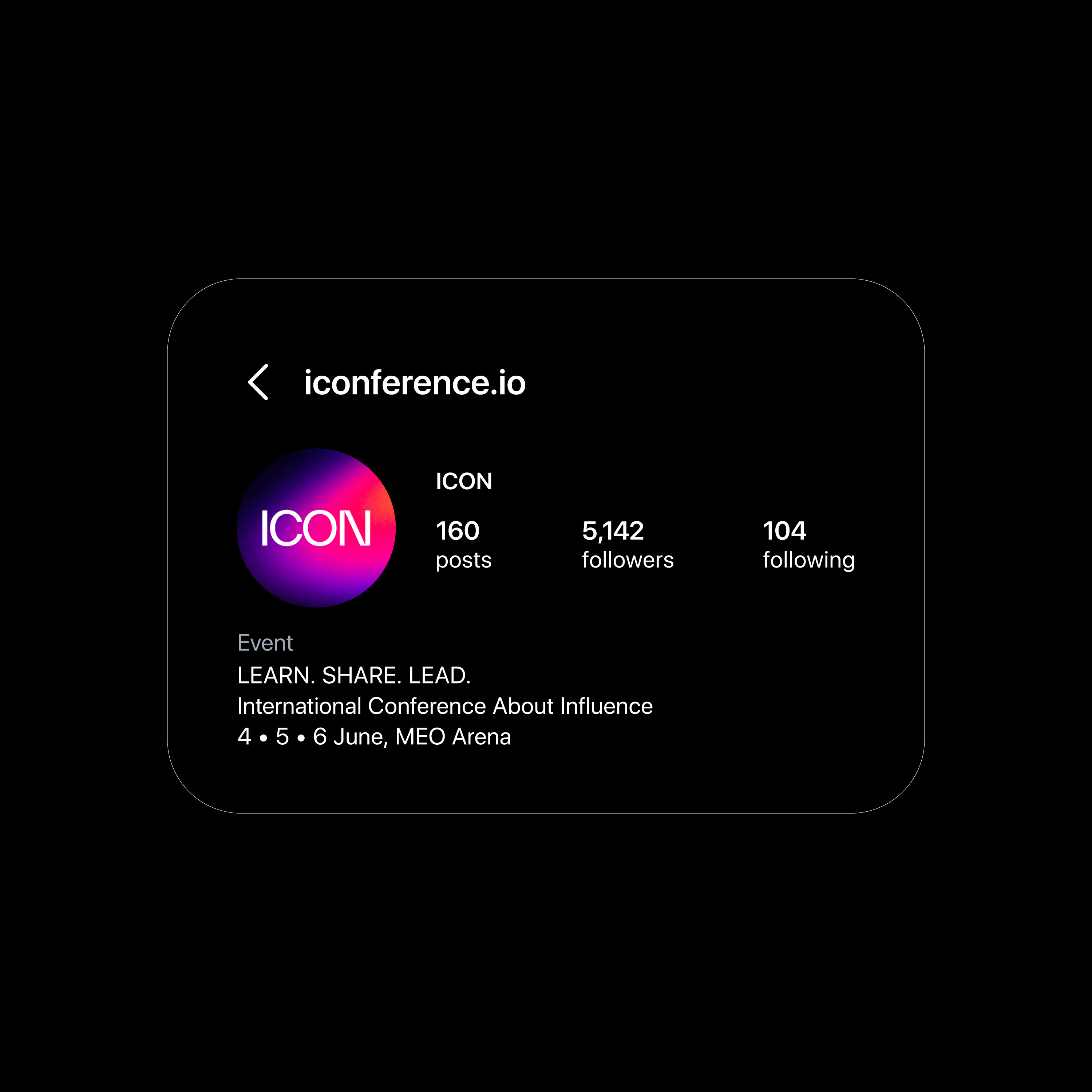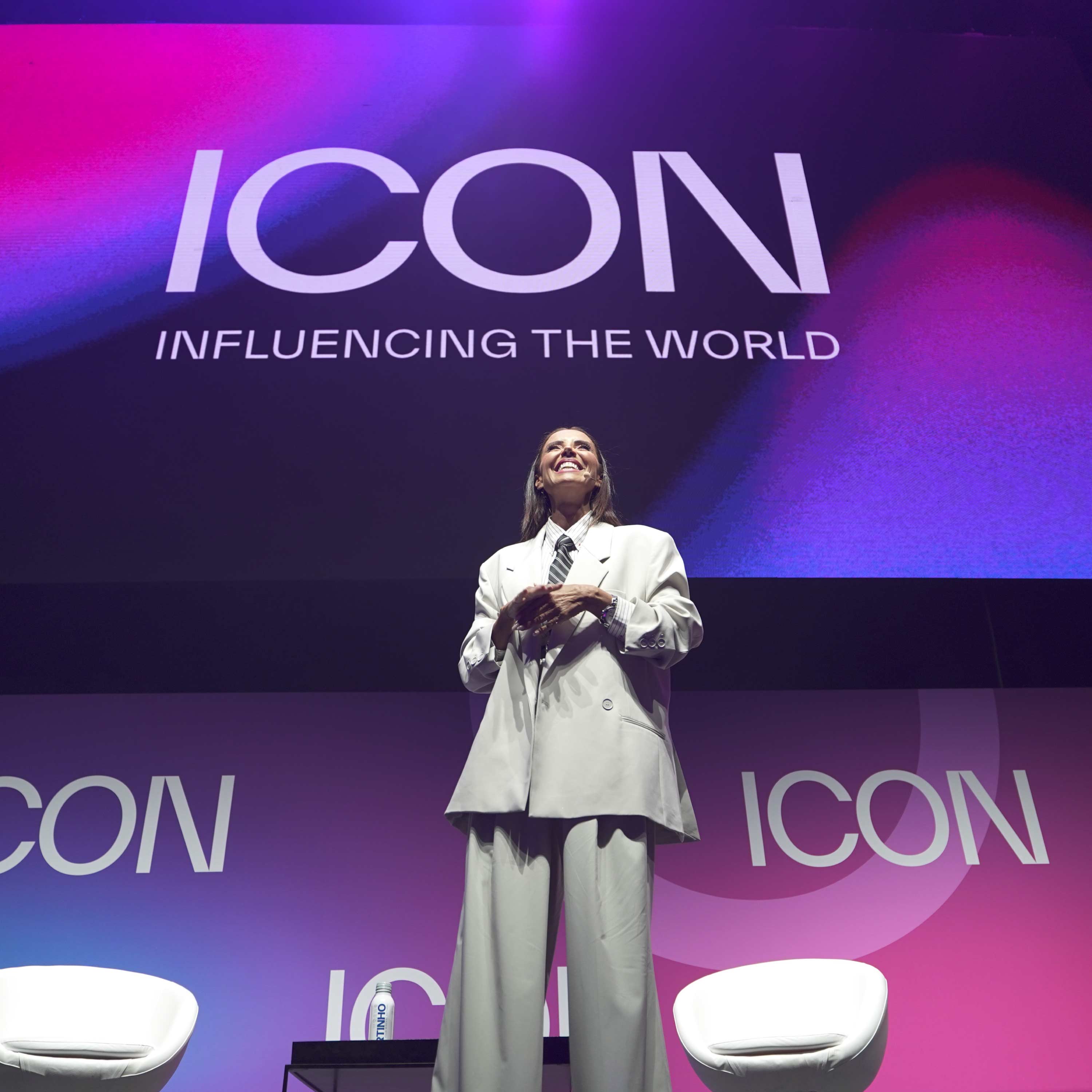
The ICON conference needed a complete identity system — from naming and concept to visuals, motion, and the entire event environment. My role was to define a creative direction that could live across digital and physical space, and create a brand that felt contemporary, expressive, and culturally relevant.


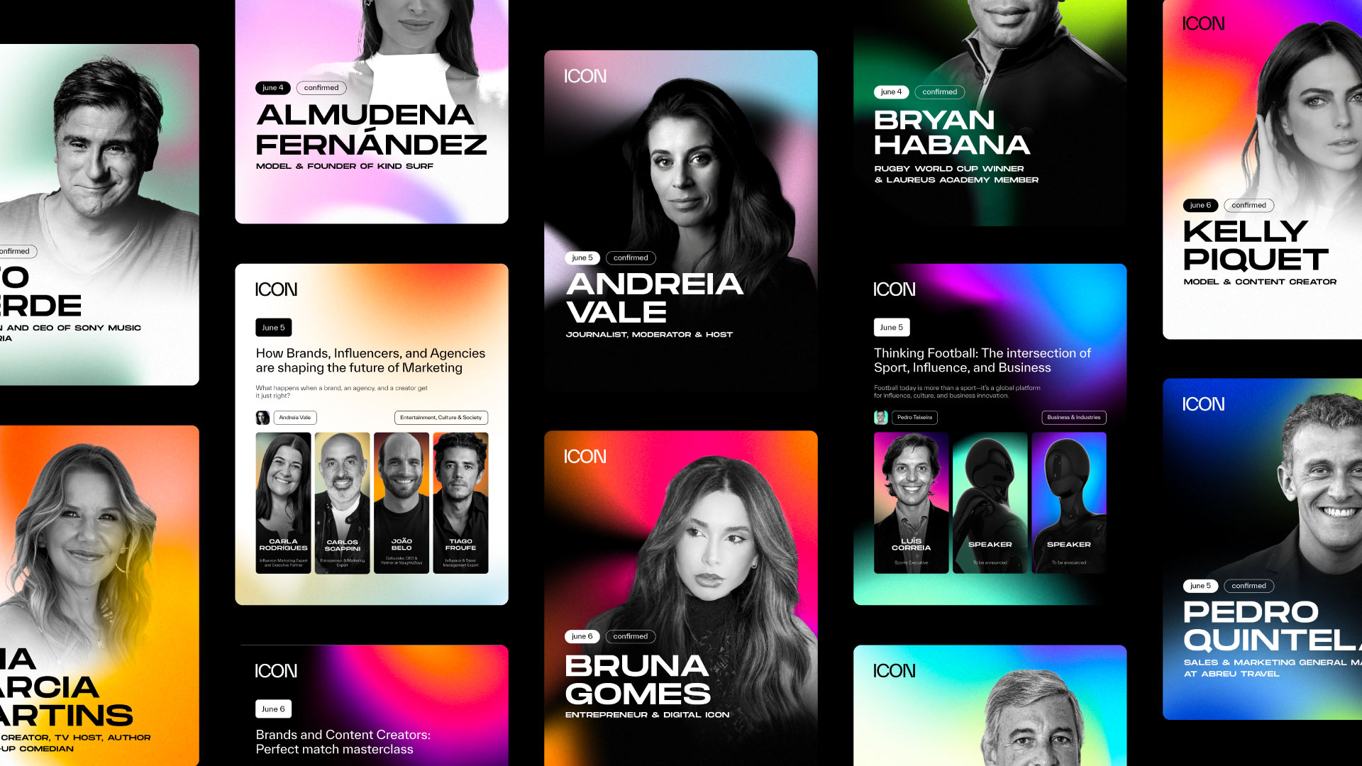
To define the visual direction, I explored how light, gradients, and movement could shape the emotional tone of the brand. These early studies helped establish a dynamic, fluid world that felt both digital and human. In parallel, I tested the system with real speakers and the mannequin figure to understand how color, texture, and photography could coexist within the same visual language.
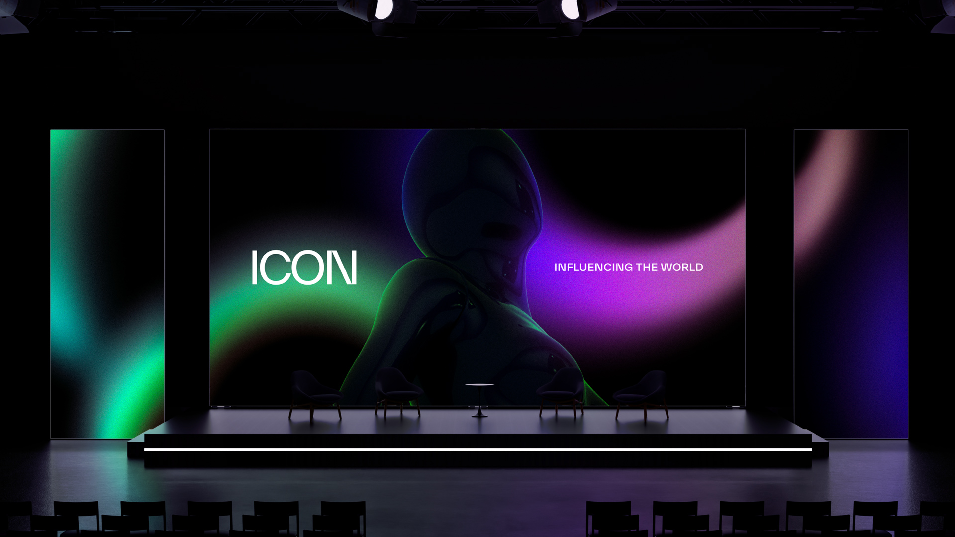
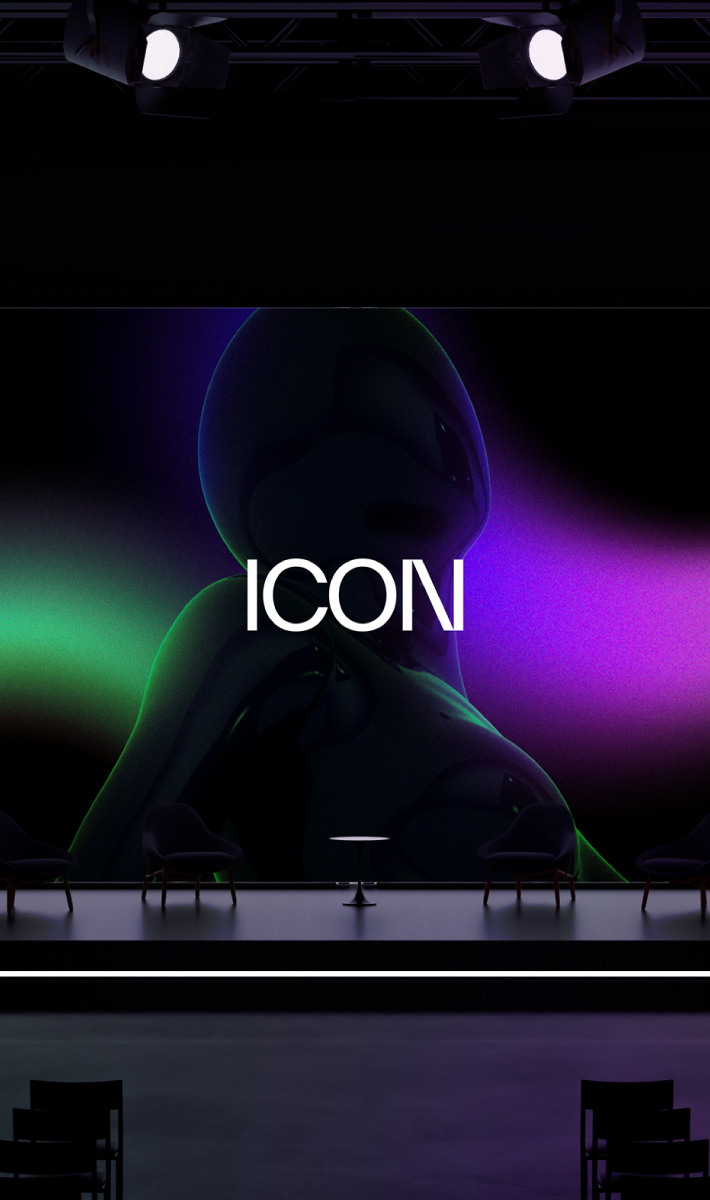
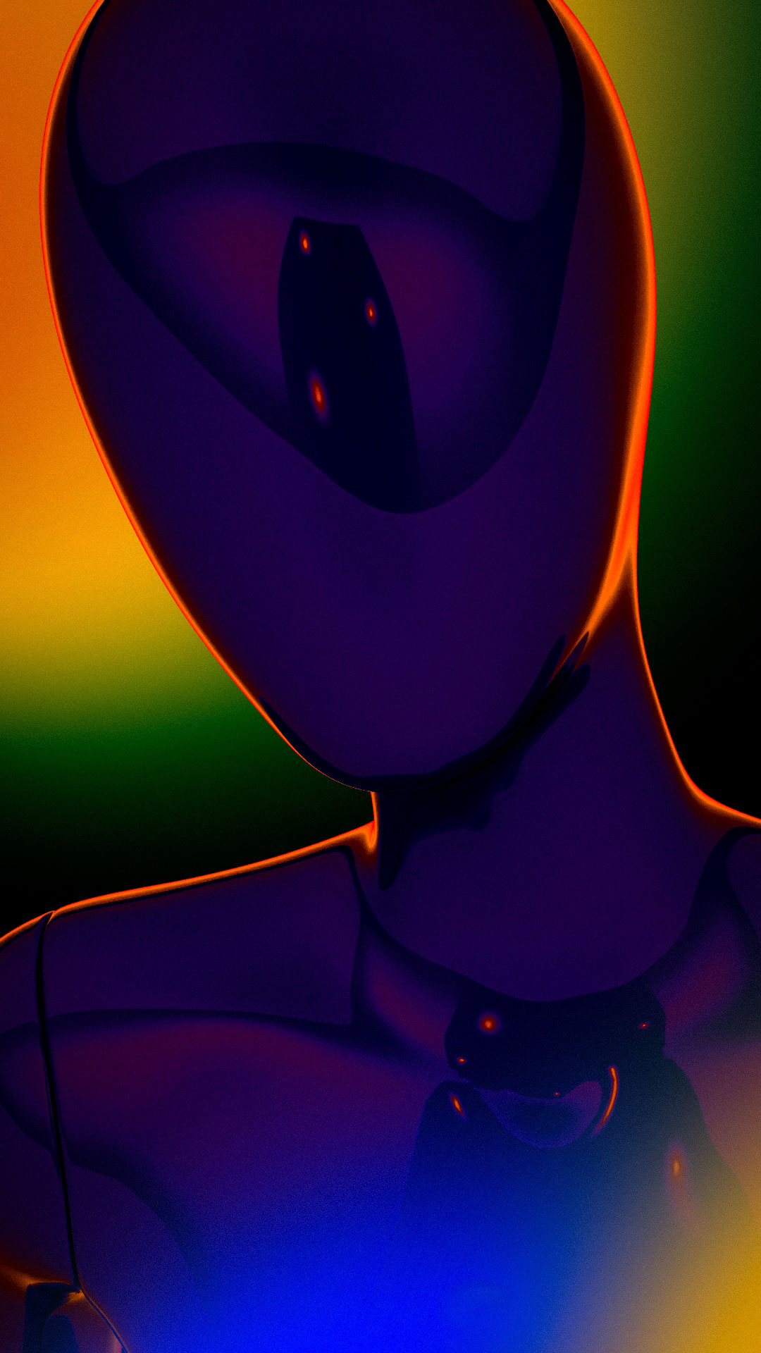
The mannequin acts as ICON’s universal symbol — neutral and faceless — reinforcing the idea that anyone can become an icon.
The mannequin acts as ICON’s universal symbol — neutral and faceless — reinforcing the idea that anyone can become an icon.
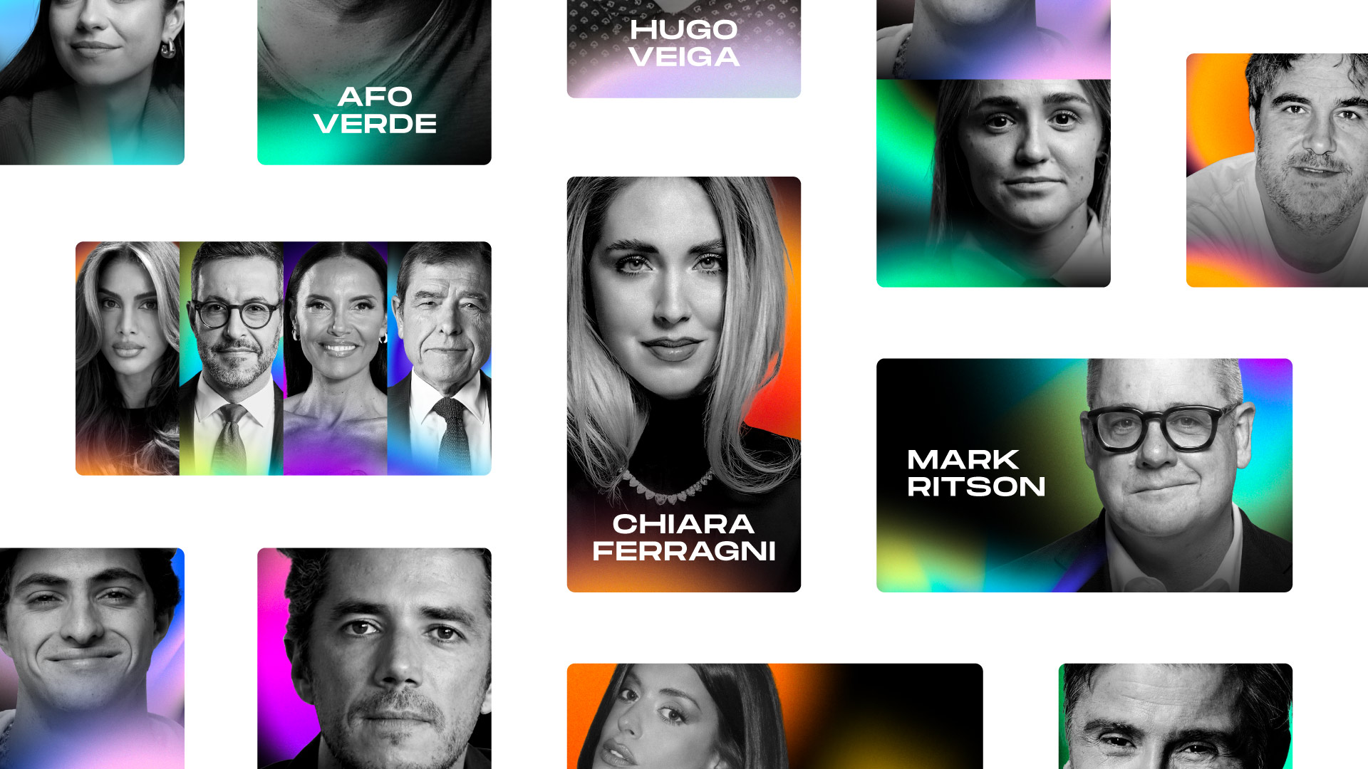
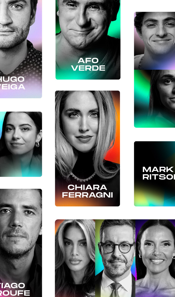
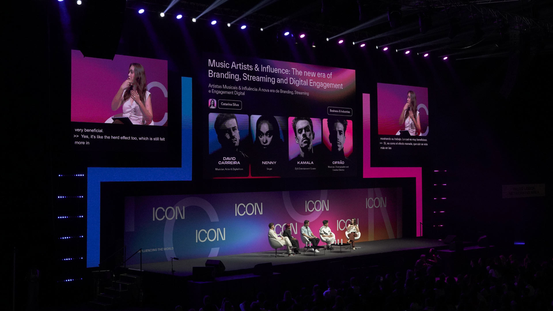
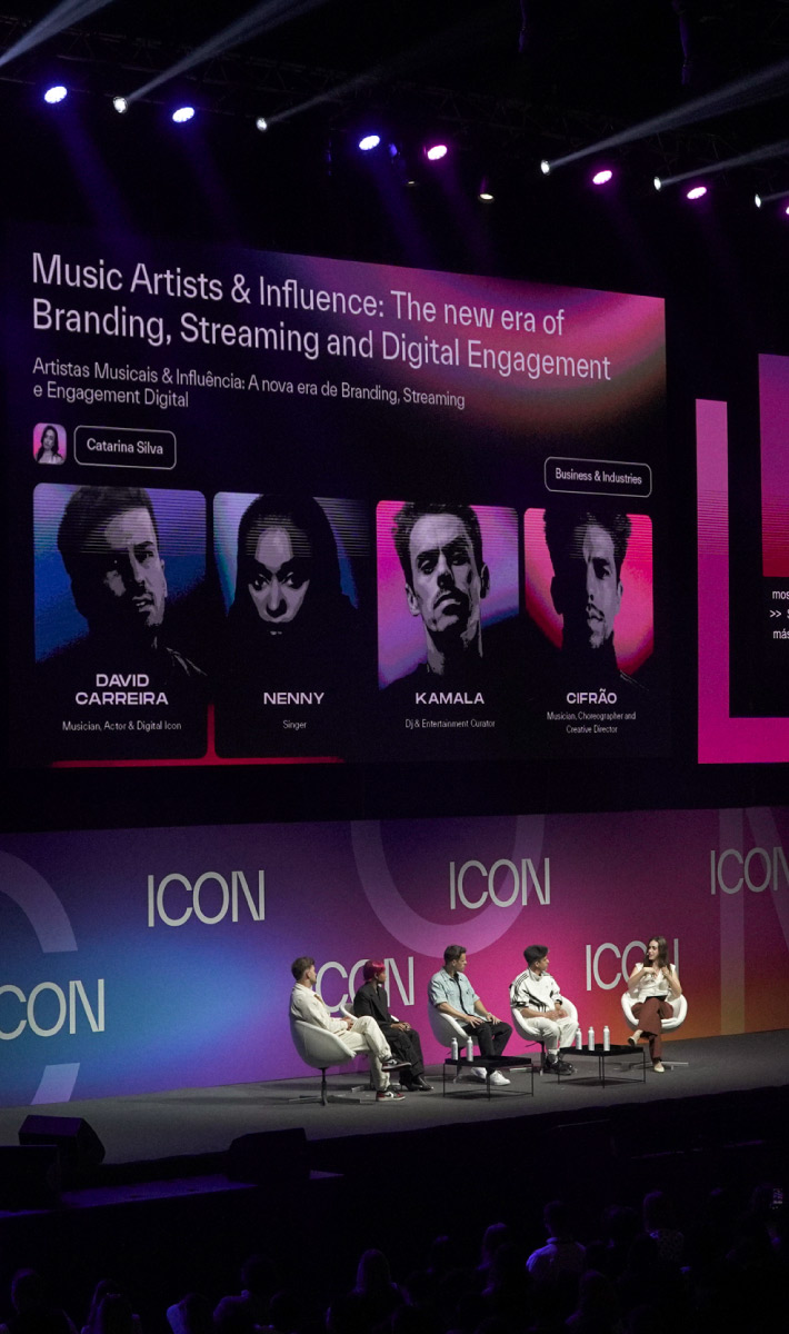
ICON’s identity was built to work under real conditions: fast turnarounds, multiple speakers, changing formats, and live environments. The system prioritised clarity, recognisability, and visual impact — without relying on static compositions.